Ten years ago, during the 25th Anniversary of the The Legend of Zelda franchise, we saw the release of two major titles. One was Skyward Sword, the newest 3D Zelda game on the Nintendo Wii, the other was Ocarina of Time 3D, a remake of the Nintendo 64 classic for the Nintendo 3DS, which was the first 3D Zelda title to get updated with a new release. Now, ten years later, we have gone gone full circle and arrived at remastering the new Zelda game from that time in HD.
The Legend of Zelda: Skyward Sword HD got released for Nintendo Switch on July 16th and now it's time to evaluate this remaster. Keep in mind that this won't be a review of Skyward Sword, where instead this review will focus on the qualities of the remaster alone. How does the game look and play like on Nintendo Switch? What has been improved? What hasn't? Let's get to it...
Visuals
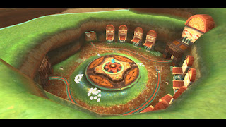
When looking at all the 3D Zelda remakes and remasters, there is a clear trend where the age of the game correlates with the number of visual updates. With Ocarina of Time 3D almost everything got remodeled and retextured and they've added a variety of new details, like to the interior of houses. Now, with Skyward Sword HD they've upscaled the graphics to HD... and that's basically it.
Sure, there are some small improvements, like to Link's model, but for the most part you get the same old game with everything blown up to HD. The textures simply got resized to higher resolutions, but it's not like they are full of new details. So, it doesn't really compare to Twilight Princess HD, where all the textures got redone by Tantalus, even though the Australian studio has been working on what's literally just Skyward Sword in HD as well. Most of that work seemed to go into remaking the interface elements in HD, however.

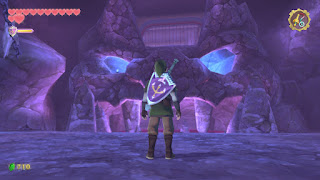
Yet... it still looks amazing, where this is one of the most beautiful Zelda games. The visuals of the original game did a good job of hiding the age of the Wii with its painted art style, where at the time other consoles already had games in HD and the Wii U would even come out one year later. But it just so happens that this art style works perfectly in HD as well, similar to The Wind Waker, but without the need of any extra effects. It just looks great by default.
Though, there are some things that probably should have been improved, but weren't. In some cases, like around the island of Skyloft, you can clearly spot the repeated textures. And some of the fences, like around Faron Woods, are still fully in 2D, which already wasn't contemporary back in 2011.
The depth of field painting effect is also still there, but it gets used with a much higher resolution, so you have a lot more details to look at from a distance. And sometimes you just want to view around, because the colors are so vibrant, where the game is just very pretty overall and pleasant to look at. It's especially pleasant because the game runs in 60FPS now, which is huge, makes everything so much smoother and also improves the game's motion controls. Speaking of...
Controls
During the era of the Nintendo DS and Wii, the Zelda series was subject to quite some experimentation around the controls, where Skyward Sword was one of the biggest titles to make use of the Wii MotionPlus gyroscope technology, which became a standard in Nintendo's hardware by now. The Nintendo Switch Pro Controller has one and both Joy-Cons have them as well.
Naturally, Skyward Sword was already at home on the Nintendo Switch with its sophisticated motion controls to swing your sword and bash with your shield, but not everyone wanted or could play with them. So, it was a really good idea of Nintendo to provide alternative button-only controls, so that you can play the game any way you want, including handheld mode.
If you want to play with motion controls, you have to use the detached Joy-Cons, but you can turn them off in the options at any time, in case you want to switch between both control methods. If you're playing in handheld mode or with a Pro Controller, you're stuck with the new controls, but you at least have the options to use motion controls for aiming and/or moving the camera.
The new button-only controls take some getting used to, but once you did get used to them, they work considerably well. Steering your Loftwing, your Beetle, Link in the air or Link underwater is now performed via the left control stick, the same with balancing yourself on tightropes or inside mine carts. Pressing that stick's button now performs any actions that were originally triggered by shaking the Nunchuk (or the left Joy-Con), like rolling or raising your shield.
The right stick then gets used for swinging your sword and using your active item, like the Whip. You get a whole other level of accuracy with this, which can save you from some frustrations that sometimes came with the motion controls. You press the right stick's button and you stab. You flick the right stick to the left and you do a horizontal swing to the left. You hold the right stick up and Link holds the sword up to charge a Skyward Strike. If you ever had any problems with these actions, then the button controls will make you happy.
However, they are not free from frustrations themselves. Because Link holds the sword when you fully press the stick, it means you really have to flick the stick to properly swing your sword. But sometimes the game registers a hold, where Link then stops attacking, even though you just wanted to mash wildly at a downed boss. And that's just bad.
Using the Bug Net is also quite awkward, because you don't have the ability to fully move and turn the net in three dimensions with the stick, where instead it realigns the opening of the net when you fully press the stick in the opposite direction. And then you have to hope that it stays that way when you're going in for a swing.
Items that require aiming basically work like in every other modernized 3D Zelda, where you can aim with the right stick or optionally use motion controls, which works much faster. Sadly, the quick draw of the bow is seemingly not supported if you play with button controls, but it works normally with motion controls. And for some reason Nintendo decided to apply the 3rd person camera control options for inversion to your aiming as well, like in Twilight Princess HD, which is just a mess and really should be separated.
Speaking of camera controls, you can now freely turn the camera via the right control stick as well. If you're using the button-only controls, however, you need to hold the L button for this, which is slightly inconvenient. But this is still better than nothing, considering that you couldn't freely move the camera on the Wii at all.
As for the motion controls, they work for the most part as they did on the Wii. Since the left Joy-Con also has a gyroscope, unlike the Nunchuk, any actions done with it are now more responsive. The Joy-Cons also don't need to be calibrated at the start, only to be recentered. But here lies the main issue...
With the Nintendo Switch there is no sensor bar to automatically recenter your aim toward the TV any longer. Well, this technique was prone to errors in itself, because other light sources could interfere with your Wii Remote, so this isn't necessarily a bad change. But the way it was implemented, you have to manually recenter your aim by pressing the Y button all the time... And that's just annoying.
Curiously, this isn't a problem with the button-only controls and motion aiming enabled. Whenever you activate an item there, like the Slingshot or the Beetle, it automatically recenters at that moment and you just have to hold still to not move in any direction. But for whatever reason Nintendo decided to not do the same for the motion controls, where you aim can be heavily off whenever use an item. As a result, you have to press the ZR button for the item and immediately the Y button right afterwards, which feels just so unnecessary, because this should be done automatically.
So, both control methods are somewhat flawed and don't really feel ideal. Some people might also want to change between motion controls and button-only controls depending on the situation... And here it would have been good to have some sort of hybrid options, where you can decide whether you want to utilize only the left or the right stick instead of motion controls. This way you could swing the sword with the Joy-Cons, but normally steer your Loftwing with the left stick.
Pacing
The game's graphics look great in HD and the new control options will enable many new players to fully enjoy Skyward Sword for the first time, but the third pillar of this remaster really have been all the small improvements to the game's pacing. There were no major changes here, so you still have to go through all the quests like you did on the Wii and there are no shortcuts this time. The focus was really on smoothing out the edges.
The loading times are much shorter, where it lets you go from one area rather quickly, which is especially nice when switching between Skyloft and the sky. On the Wii you could only skip cutscenes once you already saw them, but now you can do so right away. You can also skip through text much faster by pressing B, which really is a standard in modern Zelda games, but for some reason wasn't in Skyward Sword ten years ago. And during the tutorial phase a variety of the dialogues were made optional now.
But most importantly, you get less interruptions from Fi. The sword spirit has been notorious for being the most annoying sidekick in the Zelda series, informing you about the most trivial things with some probabilities attached. While the mechanical Captain Obvious still pops up from time to time unnecessarily in Skyward Sword HD, it has been toned down significantly and you can really feel this – mostly because your sword blinks now whenever there is one of the once mandatory hints available. And this is by far the best improvement they could have done to the game, next to the new controls.
Otherwise they've also fixed the issue with the reoccurring treasure and insect explanations, which happened whenever your turned your Wii off and started the game again. Now you really only ever get informed about your collection items once and then you just pick them up normally, which is great and also a huge time saver.
Sadly, some of the switches still trigger a short "cutscene" each time you activate and deactivate them, which is really annoying. This isn't the case for all of them, where sometimes it only shows you the change directly the first time, but ideally this would apply to all the switches in the game and not just some.
Still, with all of this is fine tuning it makes playing through the game a much better experience than it used to be. However, you still spend a significant amount of time just flying around, which leads us to the next topic...
amiibo
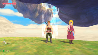
Skyward Sword HD supports amiibo, but only the one that was released together with the game: Zelda and her Loftwing. And the functionality behind this amiibo certainly has sparked controversy like no other. Scanning it on the surface will make you return to the sky immediately from anywhere. And scanning it a second time in the sky will make you return to the exact spot where you've first scanned it, even back inside dungeons.
It's essentially a new quick travel feature that can be quite useful, for example when your shield just broke and you want to quickly buy a new one. It's not needed or essential, since there are plenty of Bird Statues around, but that's not the point. It's a quality of life feature and shouldn't be locked behind a figurine, especially when these figurines get more and more expensive and hard to come by.
There also haven't been any efforts to improve the traveling otherwise. If you want to switch between Bird Statues in the same area, you still have to go back to the sky, dive down to the surface again and select the destination of your choice. A quick travel feature that lets you go to any Bird Statue on the current map would have been much appreciated...
Also, in the very least the game should have supported all other Zelda amiibo in a simple way, e.g. by providing you with treasures, insects and Adventure Pouch items on a daily basis. That's a non-intrusive method of utilizing amiibo, which already worked well in Breath of the Wild and Hyrule Warriors. So, why not do the same here?
Other Improvements
The remaster employs the same saving system as the remake of Link's Awakening, where you have an autosave feature, which gets activated quite frequently, often when you change between areas and even when you go next to a Bird Statue. You can still save manually there, where it now lets you choose between all three quest log slots. This can be useful for experimentation, but once you start doing a second playthrough (like in Hero Mode), you have to be careful not to overwrite the save data of your previous adventure.
And that's really it... There are sadly no other improvements or additions to the game. Hero Mode still has to be unlocked by beating the game once. There are no new areas and there is nothing new to find. The Adventure Pouch items would have been the perfect hook to add some additional rewards, like more of the useful Medals. Even another Empty Bottle, like in Majora's Mask 3D, would have been nice to have...
Ideally, they also would have added something exciting, like a Savage Labyrinth / Cave of Ordeals, which could have been a welcomed challenge with the new controls. But there is nothing, nada, niente, nichts. And that just feels like a huge missed opportunity.
Conclusion
Skyward Sword HD is by all means the definitive edition of the game. It looks very beautiful in HD, runs in 60FPS, has new button-only control options and shines with much better pacing and less interruptions, where it will be tough to go back to the Wii version once you've played the title on Nintendo Switch.
However, both control methods still have their flaws and could use a middle ground. The remaster also lacks any additions to the content and instead features the most shameless use of amiibo in Nintendo's history, where overall this isn't fully satisfying, especially with the full price tag attached to it.
The Good
- Game looks amazing in HD
- New button-only controls
- Lots of fine tuning to the pacing
- Less Fi
- Autosave feature
The Bad
- Motion controls need to be recentered too often
- Button-only controls can be finicky
- No hybrid controls
- Only traveling improvement locked behind new amiibo
- No new content, like items or dungeons


No comments:
Post a Comment